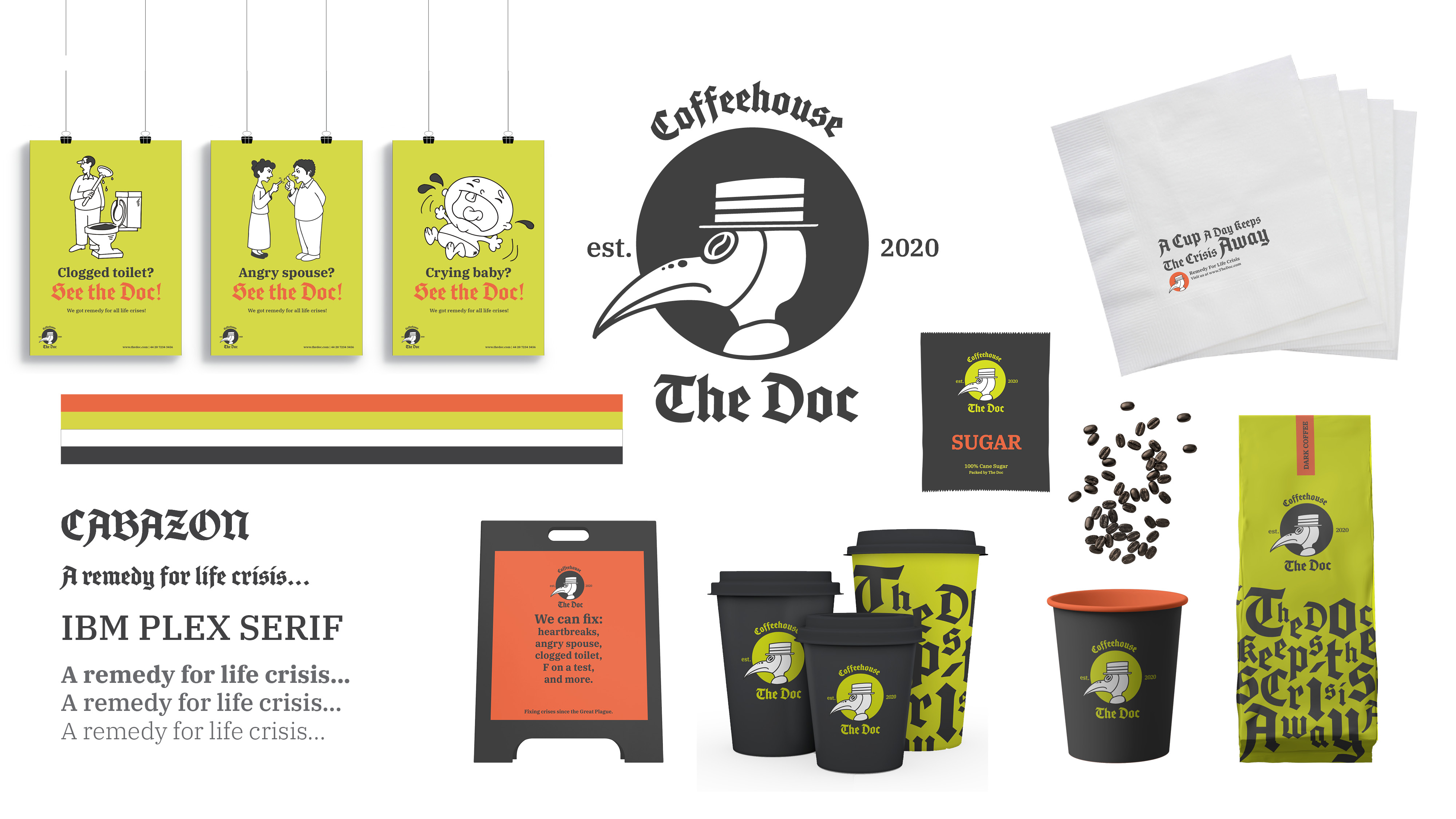
Here, Sike Chan responds to experiences in London’s vast array of coffee shops by designing a new corporate identity brand.
Students design for real-world contexts in London’s Virtual Classroom
Syracuse London’s special Design Program offers participants the opportunity to take a course in design history, complemented by studio and academic electives in a world capital renowned for its cutting-edge design. Multidisciplinary subject areas allow students to dive deeper into industrial and interaction design, interior and environmental design, or communications design.
By working in a collaborative studio environment and making frequent excursions into the city, the program helps students to better understand London and the United Kingdom while learning how design saturates everyday life and defines people’s experiences in an urban environment.
The Doc: Remedying Crisis through Coffee
by Sike Chan
The Doc is a coffeehouse taking inspiration for its brand from the Great Plague of London.
The Plague lasted for eighteen months from 1665 to 1666 and was the last major epidemic of the bubonic plague to occur in England.
Melancholy and fear were thought to make people weaker — and thus more prone to infection. Coffee, then, was believed to be an effective treatment, thanks to its ability to lift spirits.
This history, combined with London’s current affinity for independent coffeehouses and common intrigue with The Plague, informs The Doc’s ethos and identity.
A marketing campaign uses slogans like “A Cup A Day Keeps The Crisis Away” and “See the Doc!”, while signs placed outside the shop assure passersby that “We can fix any heartbreak, angry spouse, clogged toilet, F on a test, and more”, appealing to a wide range of clientele.